Art 207 Graphic Design | Identity Campaign !!!!!!! Fall 2008 | Prof. Jones
-------------------------------------------------------------------------------------------------------------------------------------------------
PART 1
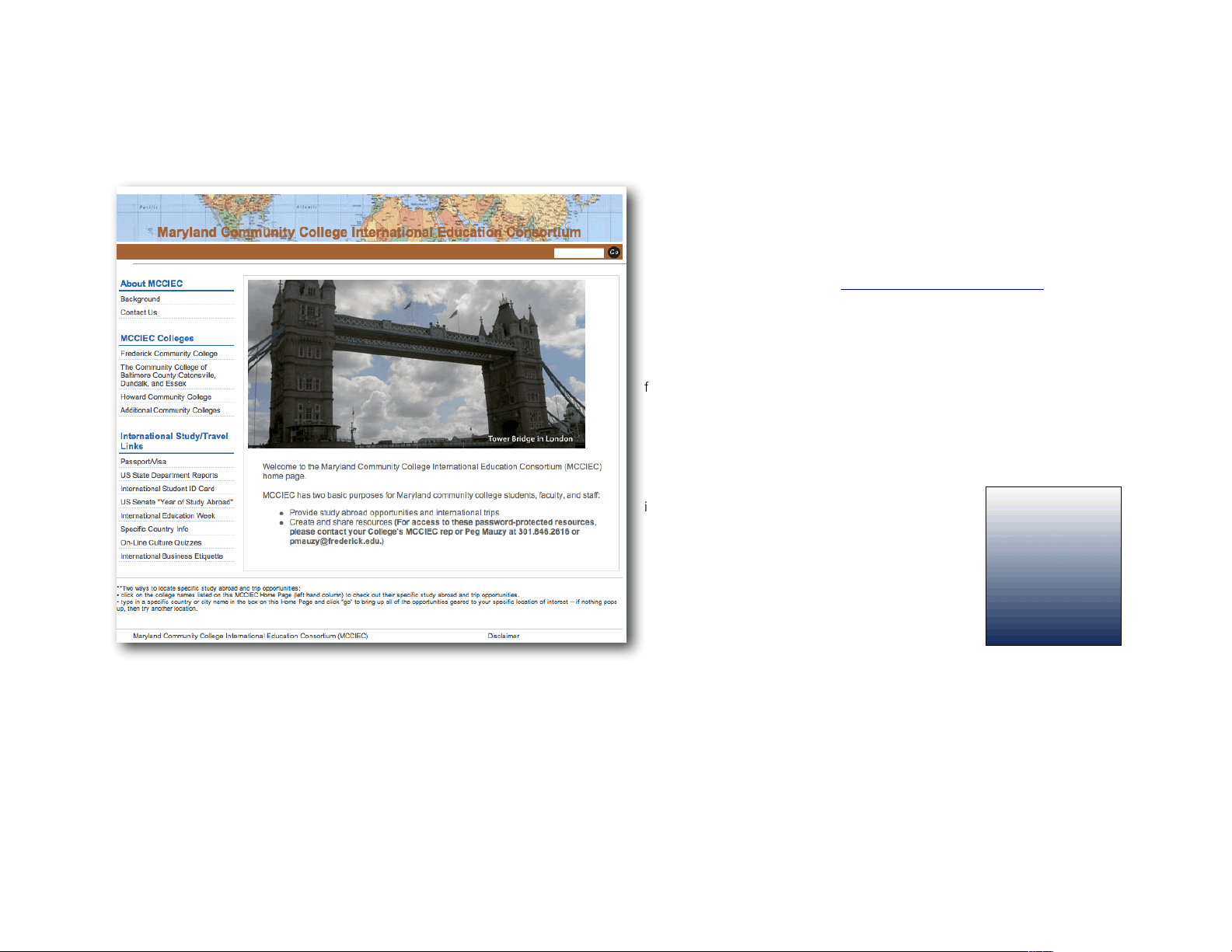
MCCIEC is an acronym for the Maryland Community College International
Education Consortium.
You can visit their website, here. http://www.mcciec.org/index.htm
They are looking to develop a new branded identity.
Read through the website and develop some visual ideas about what the
MCCIEC represents. Think of using strong symbols, graphics, type and color.
As you can see in the website, the MCCIEC logo runs as a banner across the
full width of the page. Is this the intention? Is this a logo? Does it work?
What images does the current logoform represent?
Sketch your new ideas out on paper and post them on the viewing wall, out-
side of Joppa J005 with push pins (use the long ones) by Monday at 10 am.
Your sketches should be mainly conceptual–short
ideas that address the purposes of the MCCIEC.
Find a visual form that represents the mission of this
group. Be prepared to talk about your sketches. At
a minimum, you should have about 25 sketches.
Don’t try to edit yourself out much at this idea stage.
Let it rip. Concentrate on developing a graphic form
that represents the organization. Do this all by hand.
On a letter size piece of paper, print out (with the
computer) your name (in a 3” x 9” rectangle). Post
your name next to your sketches by the deadline.
Look at other organizations that deal with international education and travel. Bring these links or copies of your research to critique on Tuesday 9/9.
DUE! ! MONDAY 9/8 BY 10 AM-PUSHPIN TO VIEWING WALL OUTSIDE JOPPA J005
CRITIQUE!TUESDAY 9/9 In Class in the Hallway adjacen to Viewing Wall.
PART 2
A Harford Community
College International
Education logo and
identity campaign.